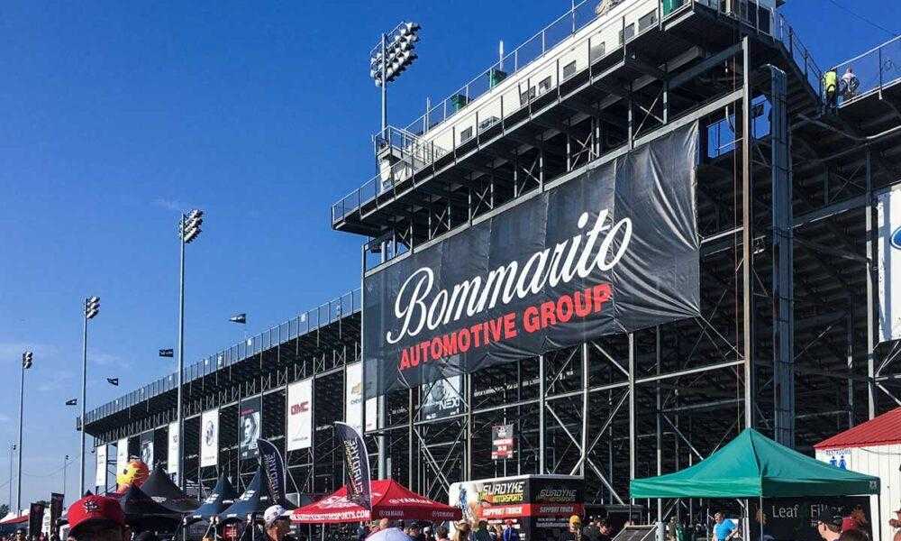
If you’re advertising your company with custom banners, are you doing everything you can to impress people?
Custom-made banners are a great way to advertise real estate properties, an event, or to announce a special offer. A well-made banner draws attention and grabs the audience’s attention.
Banners can boost your marketing campaign in more ways than one. When it comes to advertising your business, reaching a larger audience is a step in the right direction.
Do you know all about custom banners? It’s important to understand your audience and get the most out of your advertising dollars.
Learn more about various mistakes with custom banners that you need to avoid.
1. Not Using a Proper Banner Template
Not using a proper banner template can result in a cut-off, warped, distorted, or otherwise rendered unreadable and unusable designs. Throughout the design process, it is important to use the same aspect ratio and dimensions as the template.
The design should be properly reproduced and printed in order to have the desired effect.
2. Improper Use of Colors for Banners
To avoid this, it’s important to consider the colors and tone of the message. For example, bright colors help convey excitement or create a sense of fun, while darker colors can create a sense of seriousness or power.
You can also work with a color wheel to come up with pleasing color combinations. Lastly, be sure to use colors that are consistent with the organization or business the banner is representing.
3. Typos and Incorrect Spellings
You can start by carefully proofreading the text before submitting the order. Make sure to double-check all capitalization and punctuation. Be mindful of which characters may become illegible as a result of the font size or type.
To ensure accuracy, it’s best to use signature fonts like Arial or Times New Roman, which can be easily read in any font size.
4. Not Using the Proper Sizes
Be sure to measure the space in which the banner will be hung so you know what size is needed. Purchasing a banner that’s too small may end up leaving empty spaces or contents illegible.
A banner that’s too big may not have the right proportions or could interfere with other aspects of the event.
5. No Contrasts Are Used
To make the banner stand out, use contrasting colors such as yellow and black or blue and red. These colors should be used for both the text and the background. When it comes to choosing the best font, pick a font that is bold and easy to read from a distance. Give each letter some spacing; this will help make the important words more legible.
6. Using Complicated Text on Banners
To avoid these issues, choose large fonts that can easily be seen from a distance. Additionally, increase contrast by using bold, uppercase lettering, as well as choosing contrasting colors. Choose your text carefully, as excessive text can clutter your banner and make it unreadable.
Beware of These Mistakes With Custom Banners
In conclusion, Keeping these common mistakes with custom banners in mind when designing and ordering banners will help ensure an aesthetically pleasing and successful result.
Work with a qualified, experienced professional to guarantee customer satisfaction and successful outcomes.
Check out our website for more information and ideas like this!
Related posts
Categories
Recent Posts
Advertisement


